GIS Platform Cutting Invasive Species Reporting Errors by ~80%
Designing a responsive web application to modernize the control of invasive species by a federal agency, replacing paper-based workflows that had plagued the program with mathematical and time-distribution errors.
Context
Invasive species cause an estimated $26 billion a year in damages in the United States. A federal agency is responsible for controlling invasive aquatic plants and animals across multiple regions, with plans to expand nationally. The existing system: paper forms, spreadsheets, and individualized workarounds that introduced errors at every step.
Motivf was hired to replace that system with a GIS-based responsive web application. I served as the sole designer and researcher on the project from initial research through MVP delivery.
The result is the platform that streamlines invasive species tracking, EPA reporting, and treatment analysis for both field staff and program administrators.
User Groups
Three user groups were identified early. Due to the intimate nature of the project, including direct on-site access to real users, formal personas were not required. Instead, I worked directly with users throughout the process.
Biologists
The most frequent users. Agency biologists survey areas of land and water for invasive species and create control plans for applicators to execute. They need precision, context, and the ability to visualize their spatial data while planning.
Applicators
Applicators receive assignments from biologists and apply control methods in the field. They work in difficult outdoor conditions (on the water, in the sun) and must report daily treatment activities to generate required weekly EPA reports.
Contractors
For some areas, contracted applicators are assigned control plans. A single representative uses the system to receive assignments and report control actions within the scope and budget of their contract.
Define, Ideate, and Prototype
User Stories
Due to the sunsetting of the agency's legacy reporting system, three user stories from an existing backlog were prioritized, all focused on the creation of EPA-required Weekly Reports.
- Biologists: "I need to assign specific treatment plans for each site I survey, so that I can prescribe the appropriate methods for applicators to effectively manage each species."
- Applicators: "I need to input my daily treatment activities while I am working in the field, so that I do not make any mistakes when I submit my required weekly EPA reports."
- Contractors: "I need to receive assignments and complete treatment reports in a unified system, so that I am conducting appropriate treatments that are within the scope and budget of our contract."
User Flows and Lo-Fidelity Wireframes
Key screens from each of the three flows were wireframed to ensure all necessary features were accounted for before designing testable prototypes. Wireframes were presented to the client in a virtual "Design Crit" session to collect initial feedback.
Lo-fidelity wireframes presented in client Design Crit session.
"Biologists don't need to 'pair' treatments with species, our applicators are smart enough to know what to do."
"I get taken away from my computer so often that there's no guarantee I will do it all at once, let me save drafts and come back to them later."
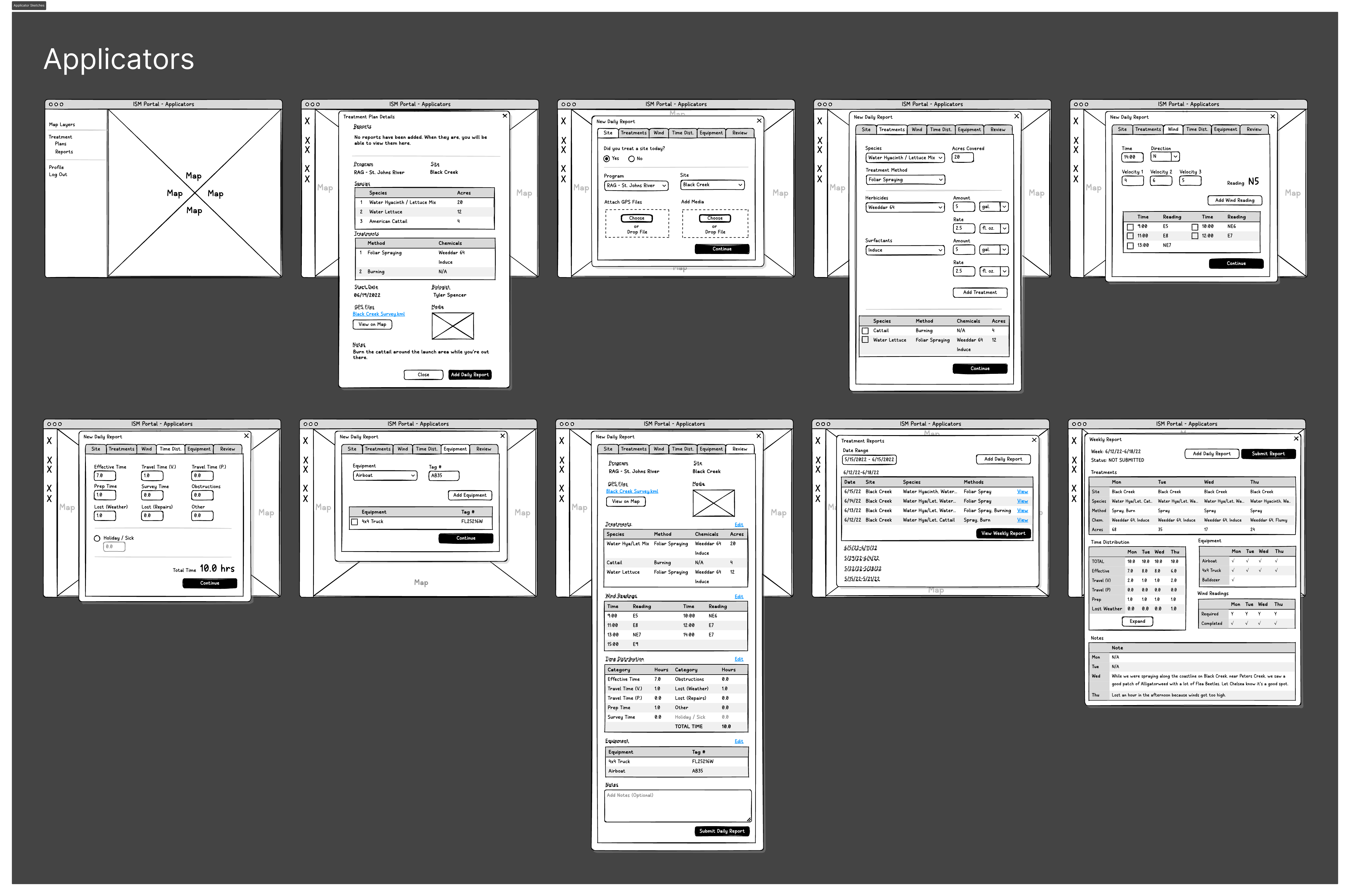
Mid-Fidelity Prototype
Taking all feedback from the Design Crit into account, a mid-fidelity prototype was created for a moderated, in-person usability testing session on site with real biologists and applicators.
Usability Testing: On-Site
Usability tests were conducted with real biologists and applicators on-site. Afterwards, a group session with all participants and stakeholders gathered additional feedback.
Quantitative Results
100% of biologists, applicators, and contractors were able to complete their respective core tasks (creating Control Plans and Daily/Weekly Reports) during testing. The core flows worked.
Qualitative Results
The more valuable data came from 300+ unique qualitative comments synthesized after testing:
"We need to see our survey tracks and geospatial files on the map while we are creating Control Plans, so we know what we're planning for." - Biologist
"Keep it simple, stupid! Calculate the chemical usage automatically and use 10% intervals when indicating Hyacinth/Lettuce Mix percentages." - Applicator
"We need to look at the plan when we're on the water. In the sun, we need high contrast and large fonts when viewing Control Plans on the screen." - Applicator
Journey Maps
Journey maps for biologists and applicators were created based on usability test results and observational field research, allowing me to empathize with the day-to-day realities of end users working in challenging field conditions.
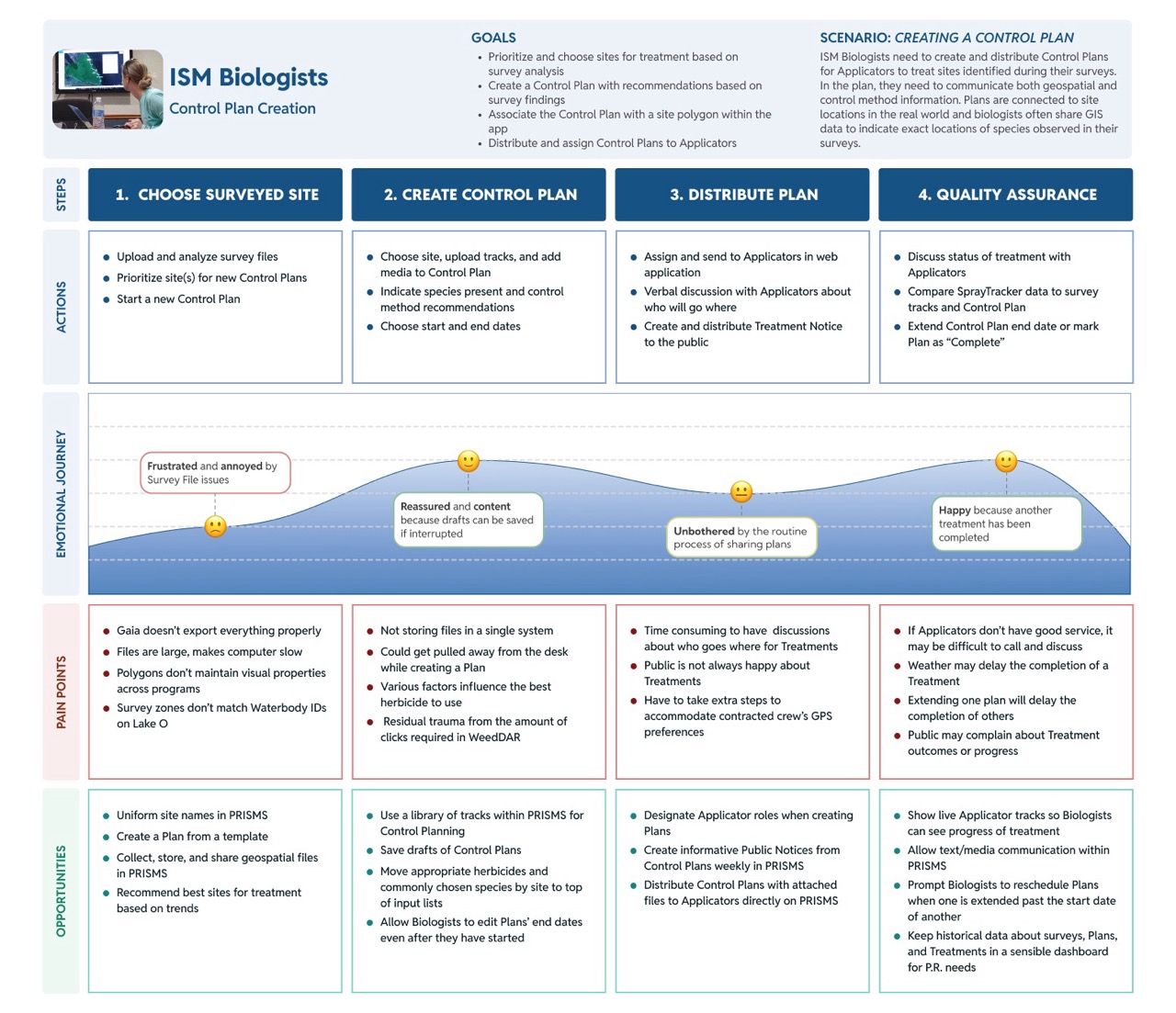
Journey maps grounded in field observation and usability testing.
Prioritization and Design System
User Story Prioritization
The biggest challenge to this project was maintaining continued ongoing program funding, which led to several pauses in work. To deliver an MVP within the available budget and deadline, a User Story Prioritization exercise of 36 new and existing stories was conducted with agency staff to determine the key features for a 1.0 product.
The main takeaway: GIS elements and functions needed to be the core of the product, not a supplementary layer.
Technical Stack and Design System
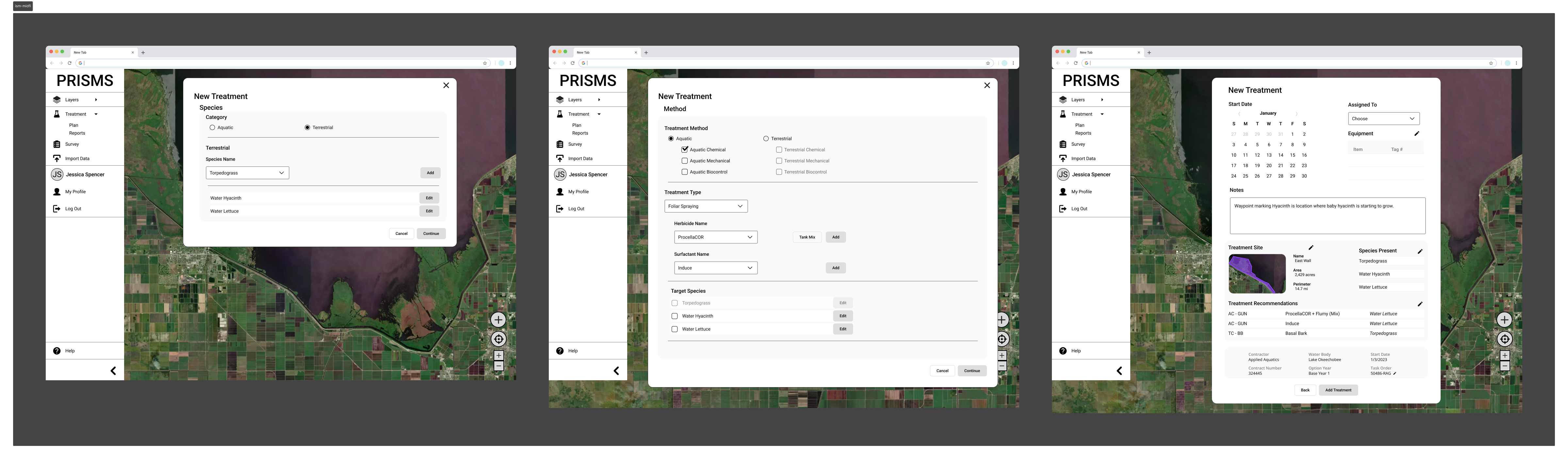
Before designing high-fidelity wireframes, I met with engineers, GIS analysts, and data visualization specialists to understand the technical stack and identify a React UI library that would enable efficient collaboration. After selecting PrimeOne UI, I made targeted modifications to create a GIS-specific design system in Figma optimized for developer handoff.
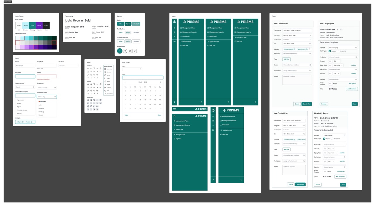
GIS-specific design system built on PrimeOne UI, documented for developer handoff.
Ideate and Prototype
Crazy Eights: Weekly Reports Dashboard
One major revision was requested to improve the Weekly Reports dashboard. Recognizing the importance of this feature to all users, I treated it as a new design challenge and completed a Crazy Eights exercise, returning to pen and paper to generate eight distinct layout concepts quickly before committing to any direction.
Mid-Fidelity Wireframes and Stakeholder Presentation
Three concepts from the Crazy Eights exercise were wireframed and presented to agency staff, giving them a direct choice about the direction they preferred. This Preference Test approach democratized the decision within the limited timeframes available for stakeholder engagement.
High-Fidelity Prototype
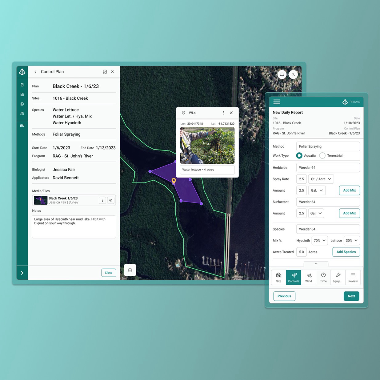
Several of the highest-ranked User Stories were related to GIS capabilities, driving a redesign that prioritized GIS functionality first and foremost. Mobile and tablet designs were created in parallel to support applicators working in the field.
"We need to see our survey tracks and geospatial files on the map while we are creating Control Plans, so we know what we're planning for." - Biologist (addressed in Phase 2 redesign)
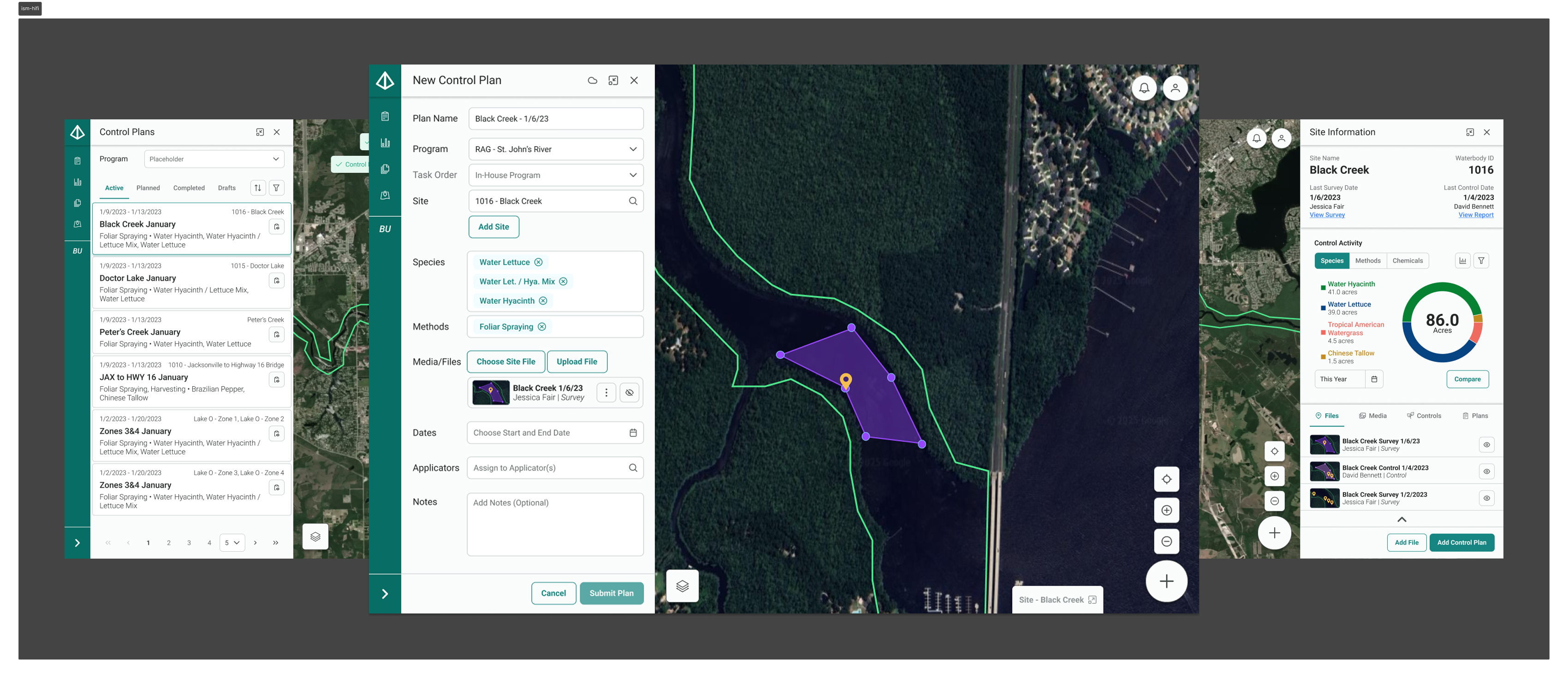
Using panels allows users to view the map while creating Control Plans. Geospatial files can be created directly in the app or uploaded from another device.
Testing and Handoff
Virtual Preference Tests were used in stakeholder meetings to democratize design decisions within limited engagement windows. To complete handoff to the client, I assisted in writing test criteria for User Acceptance Testing and held check-in calls with the client throughout the QA process.
Results
The platform launched and immediately demonstrated measurable impact on the program it replaced. All outcomes are estimates based on program data.
Lessons Learned
This project demonstrated the importance of maximizing time when up against hard deadlines and limited stakeholder access. With ongoing program funding creating unpredictable pauses, every on-site visit had to count, which meant entering the field with sharp hypotheses and leaving with enough qualitative data to sustain months of design work remotely.
Working within an existing React component library (PrimeOne) also taught me when creative solutions are actually needed within technical constraints, and when they aren't. Not every GIS interaction problem required a novel pattern. Most of the time, getting the fundamentals right (a visible map, legible field labels, automatic calculations) was enough to transform the experience for people doing real work in difficult conditions.